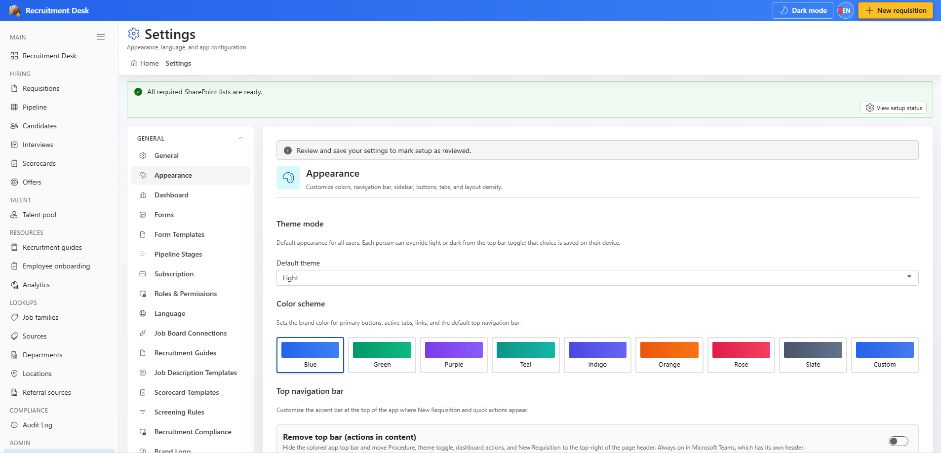
2.1 Sidebar navigation
Navigation is grouped into sections. Items are hidden automatically when your role does not grant access to them, so a read-only reviewer sees fewer entries than an administrator.
| Section | Items |
|---|---|
| Main | Dashboard |
| Hiring | Requisitions, Pipeline, Candidates, Interviews, Scorecards, Offers |
| Talent | Talent pool |
| Resources | Recruitment guides, Employee onboarding, Analytics |
| Lookups | Job families, Sources, Departments, Locations, Referral sources |
| Compliance | Audit log |
| Admin | Settings |
2.2 Header actions
- New requisition — the primary action, available to anyone who can create requisitions.
- Theme switch — toggles light and dark mode when enabled in appearance settings.
- Language — switches the interface between English, Spanish, French, and German.
2.3 Common list controls
Most modules share the same controls, so once you learn one register the rest behave predictably.
- Keyword search across the main text fields of the list.
- Dropdown filters for status and the most relevant lookup, such as department or tag.
- Row actions on the right of each row for edit, delete, and module-specific commands.
- Summary badges above the table showing counts for the current filter.
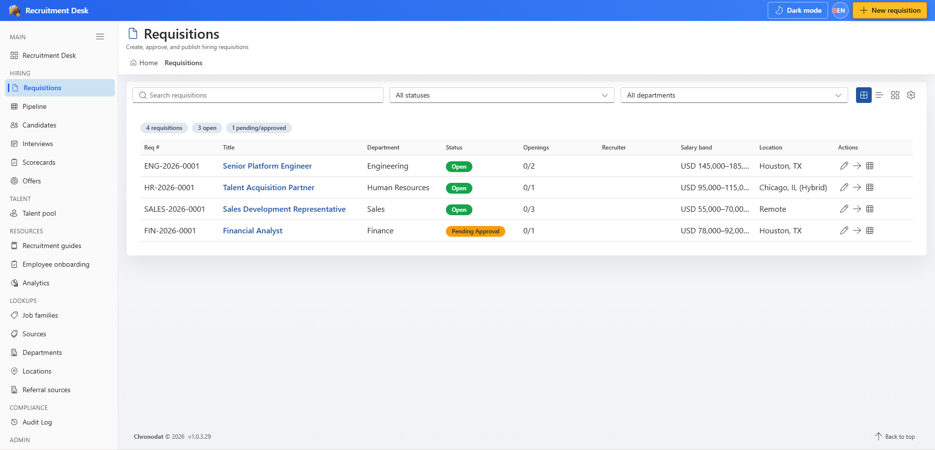
Search, status filter, and department filter sit above the table. Row actions appear at the end of each row.
2.4 Appearance
Administrators control the look of the workspace from Settings → Appearance. Choices apply to everyone on the site.
- Theme mode: light, dark, or follow the system setting.
- Colour scheme swatches plus a custom brand colour.
- Separate colours for the top navigation, its call-to-action button, and the sidebar.
- Rounded corners, compact mode, and base font size.
- Options to hide the app top bar, the SharePoint page bar, the suite bar, and the site's left navigation for a full-screen feel.
- A switch to show or hide the dashboard charts.